
The Artist's Palette: Van Gogh, A Book Review Part 2

Vincent Van Gogh: How Red made his Paintings Blue
This is Part 2 of my book review for The Artist's Palette: The Palettes behind the paintings of 50 Great Artists. Click the links to read Part 1 and Part 3.


Everyone knows the basic story of Van Gogh. The struggling artist who died poor and unrecognized but loyally loved by his younger brother, and who posthumously became one of the most recognizable and sought after artists of all time having created over 2,000 works in only ten years. However, what isn't always understood about how Van Gogh painted is his use of complementary colors and how complementary colors influenced his color palette choices.
Although Van Gogh began to make art around 1880 when he was 27, after failing spectacularly in numerous other occupations (VG was one difficult SOB), it wasn't until June of 1884, when Vincent read a book by Charles Blanc called “The Artists of My Time,” among others, that Vincent began to find his voice.
When Van Gogh read the works by Charles Blanc he learned about color theory. Specifically how the complementary pairings of red-green, yellow- purple, and blue-orange can intensify and reinforce the vibrancy of their color partner.
There was just one problem, Van Gogh had yet to understand the practical application of these new found ideas until he went to Paris in 1886.
Van Gogh's artistic life and his color palettes can be separated into three main life phases:
Hague, Nuenen and Antwerp: EarthTones (1883–1886)
Paris: Complementary Colors and Pointallism (1886-1888)
Arles and Saint-Rémy: Emotive Color Expression (1888-1890)
To truly understand Van Gogh and who he was as an artist, it is important to understand how and why Van Gogh painted before Paris (Pre 1886), as well as how and why he painted after Paris (Post 1886) and how his use of complementary colors changed.
The Artists Palette uses the above portrait, Marguerite Gachet at the Piano, 1890, as its primary example of Van Gogh's palette, and says this about the painting and how Paris changed his understanding of color:
"A couple of months before painting [Miss Gachet's portrait], he asked [Theo] for the following large tubes: 12 zinc white, 3 cobalt, 5 Veronese green, 1 ordinary lake, 2 emerald green, 4 chrome 1, 2 chrome 2, 1 orange lead, [and]2 (artificial) ultramarine (p104)...In a much earlier letter (5 August 1882), written at a time when he was still largely painting in a dark palette dominated by ochers, browns and blacks, van Gogh sketched a small, orderly palette consisting of nine colours... Van Gogh had not yet been to Paris at this point, he had not yet discovered the full potential of cadmiums, chromes, emerald and viridian (p105)...
And so while The Artists Palette attempts to help us understand that Van Gogh's arrival in Paris contributed to a shift in his color palette, it does so out of sequential order and does not address what is meant by the "full potential" of these colors.
That "full potential" was an understanding of how to use complementary colors correctly, as seen below.


Complementary colors sit opposite of each other on the color wheel. When used next to each other they intensify their partner.
Purple pairs with yellow, blue with orange, and red with green.
Before going to Paris, Van Gogh did not understand that in order to utilize the relationship between the two colors you do not mix the two, but instead place them next to each other.
When perfect complementary colors are mixed you will achieve a beautiful black-gray, however, if the two colors mixed are not exact complements the mixture will turn into a brown or gray mud mess.
This is why his paintings after 1884 but before Paris in1886, like The Potato Eaters, 1885 and Head of a Woman, 1885 (below), are full of drab colors and odd mixtures. Yes, Van Gogh is attempting to convey the difficulty of life via his color usage in both of these paintings, however, he clearly does not have a complete grasp on how to use the complementary colors of Red and Green in order to achieve his desired outcome. Instead he mixed his colors. The result being a muted and dulled painting. In contrast we see how he understands the "full potential" of Red and Green in Marguerite Gachet at the Piano, 1890 (below). The colors are vibrant and accentuate each other.

But before we look deeper into Van Gogh's complementary colors use, first let's cover what colors Van Gogh used and their modern equivalents.
Van Gogh's Most Common Color Palette
Blues
Cobalt Blue
French Ultra Marine
Prussian Blue
Greens
Viridian
Emerald Green
Extremely poisonous containing high levels of arsenic.
Veronese Green
Cinnabar Green
Extremely toxic with high levels of mercury.
Yellows
Lemon Chrome Yellow
Fades
Chrome Yellow No. 2
Fades
Cadmium Yellow
Cadmiums were newly invented, and were not color fast. Today's versions are colorfast.
Naples Yellow
Originally made with lead.
Oranges
Orange Lead
Toxic
Chrome Yellow No. 3
Reds
Vermillion
Germaine Lake
Carmine
Ordinary Lake
Red Ochre
Whites
Silver White
Zinc White
Lead White
Browns
Yellow Ochre
Burnt Ochre
Raw Sienna
Blacks
Ivory Black
Modern Equivalents
Blue
Cobalt Blue
Caution, Cobalt is toxic, Phthalo blue is a good alternative.
Ultra Marine
Prussian Blue
Greens
Viridian
Emerald Green or Emerald Green Hue
Today you can no longer purchase the original, but many companies make substitutes.
Veronese Green
While nontoxic, not all companies make it.
Cinnabar Green
a bright yellow-green paint that is now nontoxic, not all companies make it.
Yellows
Cadmium Lemon
Toxic, use caution.
Hansa Yellow
Nontoxic Cadmium cousin.
Napes Yellow
Now nontoxic.
Oranges
Permanent Orange
Hansa Yellow Deep
Indian Yellow
Reds
Cadmium Red
Toxic, consider Napthol red.
Alizarin Crimson Permanent
Quinacridone Magenta
Quinacridone Red
Browns
Yellow Ochre
Burnt Ochre
Raw Sienna
Blacks
Ivory Black
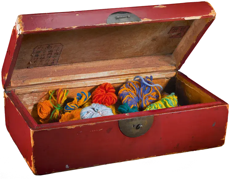
In Paris, Van Gogh finally understood how to use color theory and complementary colors while studying the impressionists and Japanese block prints. Van Gogh even went so far as to create a box full of woolen yarn where he could combine colors together before he even started to paint. He did this in order to create the most advantageous color combinations. Below is a video explaining how he did this:
Sadly many of these color combinations have been lost to us today. Van Gogh's heavy use of fading colors such as Germaine Lake and Chrome Yellow no. 2 have changed the paintings we have today from the artist's original intent.
Let's look at three of Van Gogh's works and how they no longer look the way he painted them.
Irises 1889
Van Gogh painted the purple irises outside of his hospital's window (right). However, now the Germaine Lake has faded, leaving us with their iconic blue hue (left) and without the Purple-Yellow and Red-Green complementary pairings.

You can read more about how this painting has been studied here.
Sunflowers 1888 Toyko Version
Van Gogh painted the same sunflowers a handful of times over. Below you can see the Tokyo version. In this restoration you can not only see how the Chrome Yellow no. 2 has faded (left) from the original (right), but also how originally the flowers would have had purple centers (hard to see, but trust me they are there), to complete his Yellow-Purple pairing.

You can read more about the Sunflowers here. Or watch the video below:
Irises 1890
When looking at a Van Gogh always ask yourself, what should have been the complements in this painting?Take Irises from 1890. Like before, the Germaine Lake has faded from both the flowers and the background, leaving what would originally would have been a Red-Green and Purple-Yellow complementary pairing muted.

You can watch a really great, albeit without sound and only text, video about how these color changes have been documented throughout time (I recommend watching at 1.7x):
So, yes, The Artist Palette is correct. Van Gogh did discover the "full potential" of the vibrant colors he began to use after visiting Paris, but the book either doesn't understand what that potential was or just fails to explain the importance of complementary colors to Van Gogh's vision.
You can continue to read part 3 of my review here.
If you would like to keep up to date on all of my blog posts, sign up for my Newsletter below:


Comments